CBridge: an approach for reducing carbon emission on cloud storage
Overview
This design thinking study is undertaken for the course TECHIN 521 Design Thinking Studio during my study in the Master of Science in Technology Innovation program at Global Innovation Exchange, University of Washington. My role in this team project includes:
- User Researcher
- Technical Researcher
- Software Developer
Our design question is: “How do we enable internet students to increase the efficiency of cloud storage in the use of networkable electronic devices in order to reduce electricity consumption in the gas emission ?“
Problem Space & Justification
Background
During the era of the Fourth Industrial Revolution, cloud computing has become a day-to-day tool for every Internet user. Moreover, Internet users tend to store their files on cloud storage instead of their own devices nowadays for several reasons (such as group collaboration, file sharing, file transfer, etc.).
Problem Scoping
From our secondary research, we found out that a single datacenter’s power usage is equal to 50,000 homes. Moreover, for each gigabyte file stored online, it consumes 3-7 kWh of power usage every year, which is about 1.9 kg of CO2 emission per year. It is about 1 million times carbon emission if you store your file online instead of on your own device. Therefore, we found that we should promote the efficiency of cloud storage to reduce wasted carbon emissions.
Primary & Secondary Researches
Secondary Research
We found the following results from our secondary research:
- Students are more likely to use cloud storage than full-time workers
- A successful brand on the business part is to shape the client’s perceptions of who they are. For providing discounts to users, especially for students who usually use it, it is essential to create trust and help build a reputation.
- The key benefit of storing your files on iCloud drive is the ability to share them easily, both with access to personal use and teamwork. It is an attractive option for creators who might need extra storage space.
- The advantages of cloud usage are more convenient to use without a physical drive, remotely updating & sync your files, and keeping their files encrypted.
Areas to improve: I think I should do more comprehensive secondary research the next time. For this course, our time was limited for scoping (maybe less than one week), so we did not get every information that we need to settle down the scope at the start point. As a result, our design question changed multiple times after our proposal, but that is actually something we have anticipated.
Primary Research
During our field study, we found out that:
- We focus on people who use the cloud storage service around the age 18 - 30 (most in 18-24) during the field study
- Most respondents create a folder before they collaborate with others while using cloud storage.
- The rest of the users only spend a small amount of time organizing their cloud storage, which has the potential to lead to huge storage waste.
- Nearly half of the users who took our survey said they organize their storage because their usage is almost complete, which also indicates that there has always been a large amount of cloud storage waste for most of the users.
Meanwhile, for our survey, we found out that:
- Half of the respondents have a technology background, and another half have a design background. We found that different backgrounds have different behavior.
- Most of the respondents use cloud storage 2-3 times a week
- 34.5% of respondents are most likely to back up their files in cloud storage services.
- Most respondents upload their local images, video, and texts while working.
- Most of the respondents think that the drawback of cloud storage is that it is internet dependent and needs cost for extra space.
Areas to improve: another thing that I could improve had I done this design problem another time is to add some statistical analysis to our survey. Most of our survey results are qualitative instead of quantitive. I think it would be better if I could do a thorough analysis of the gathered data so that we could know more about the users concerned.
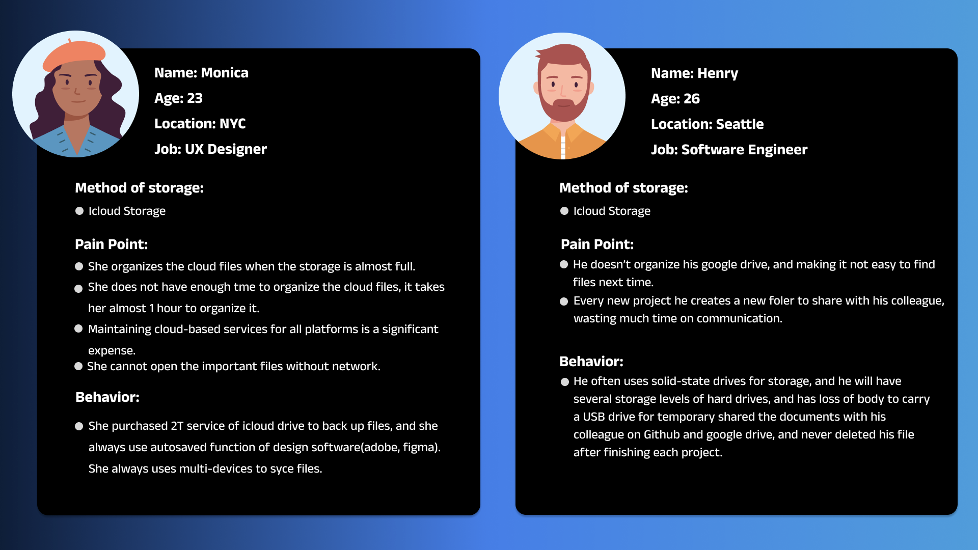
Persona
Requirements
Drawing from our user research results, we set up the following design requirements from user, business, and technological perspectives:
User Experience
- The solution must help users to reduce useless files saved in their cloud storage. (High) Looking back at our survey results, file organization is one of the biggest challenges that users use their iCloud storage. In our 29 survey responses, 46.7% of people organize their cloud drives while the storage usage is almost full. Being able to decrease the storage capacity for our target users will also decrease the overall electronic consumption in the gas emission.
- The design should set up a time clock (like the Pomodoro switch) to remind users about the organization;(High) In our survey results, 66.3% of people spend 0-30 minutes organizing their files each time, and 16.7% of people never organize their storage, only 3.3% of people spend 1-3 hours on the organization. During the result, we recognized that helping users by reminding them to organize is an option to save them time.
- Group work sharing needs to be adjusted in the theme templates ; (High) Most of the users in our survey results would like to use iCloud storage while group working, it is necessary to help these target users on designing several theme templates, and they could follow up user flow to reduce useless files/docs/photos during their work times.
- Based on the user scenarios, the upload mechanism needs to be simplified ; (Medium)
- Build a bridge ( Like some lightweight functions) between cloud storage and local storage, to increase the efficiency of cloud file storage and reduce the inconvenience of local storage. (Medium)
Business
- Universities need to cover the membership fee for their students; (High) After COVID-19, many universities tend to use online tools to upload assignments and encourage students to use cloud storage for group work. However, they ignored that many students couldn’t afford to pay the membership fee. The end business goal has to be affordable for students and universities need to cover the membership fee for students.
- Support funding options to students in choosing their preferred storage platform. (Low) Based on the survey result, 53.3% of people would like to use their local storage on their device, and 6.7% of people prefer an external USB drive. We hope that students have their own choices on dividing the funding option supported by universities.
Technology
- The variety of cloud storage needs to be considered for safety, quickness, and convenience. (High)
- Set up the numbers of the energy cost of data storage per gigabyte; (High)
- The mechanism of backup supports target users’ needs. (Medium)
- The platform should have some function for users to easily synchronize their files from their devices. (Medium)
- The cloud storage can add notifications to notify users about the efficiency of the file they store. (Medium).
- Build a platform , combining cloud storage and local storage. (Medium)
- Create an app that can easily synchronize different cloud storage platforms. (Medium)
- The platform should meet some basic safety requirements (Medium)
Areas to improve: at first, we did not know that we should do the triangulated insights to bring out those requirements, so that was actually a big mistake, since we need the information gathered from the secondary research, the field study, and the survey to know user’s patterns. Therefore, our design requirements were not ideal (for the first version without the triangulated insights). I think the next time, we should first get the triangulated insights done carefully, and find out those overlapping parts which let us know users better.
Ideation
After settling down the design requirements, we gathered together for a brainstorming session to find out what functionalities our product should have to not only fulfill those requirements but also better achieve our design objectives.
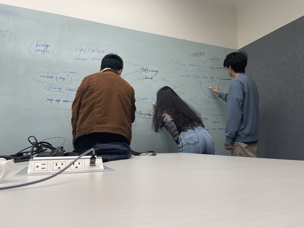
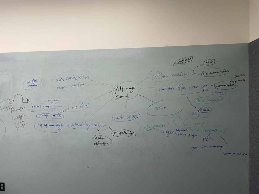
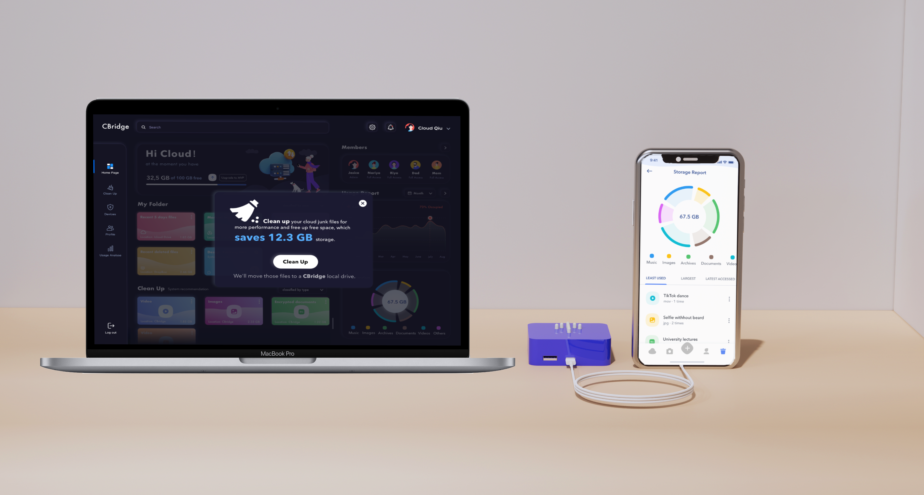
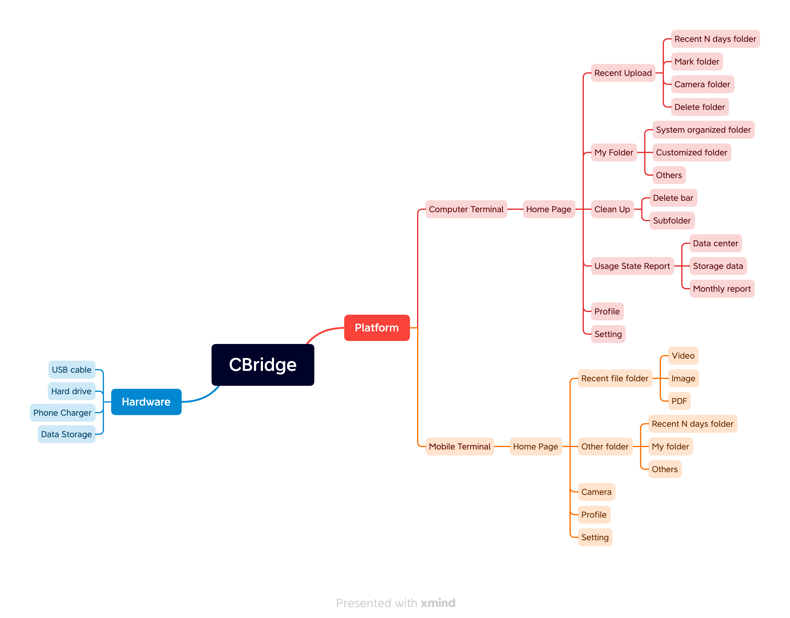
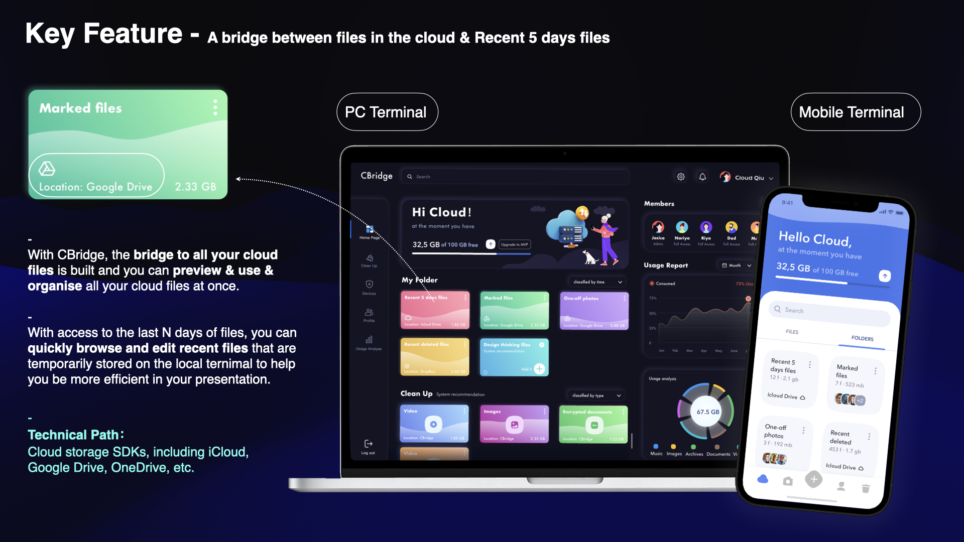
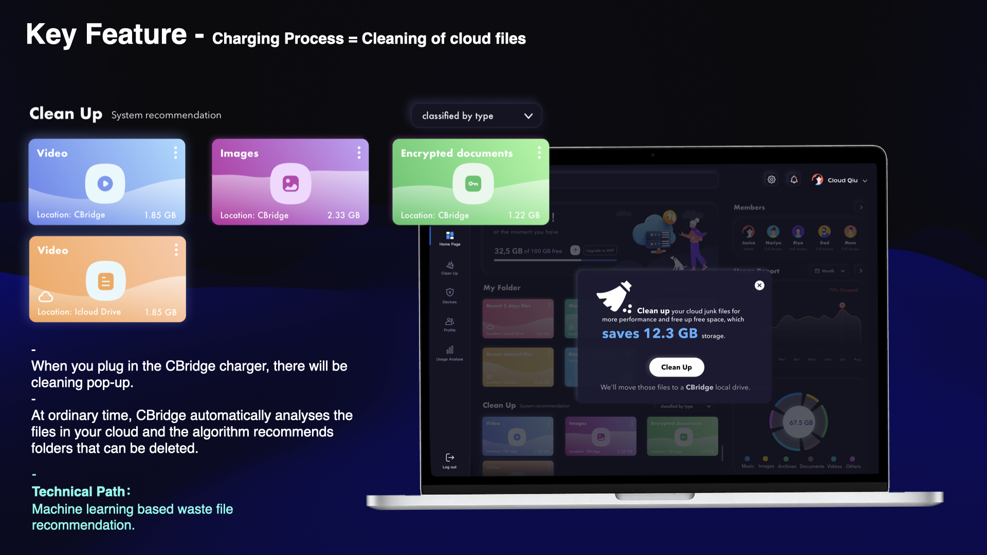
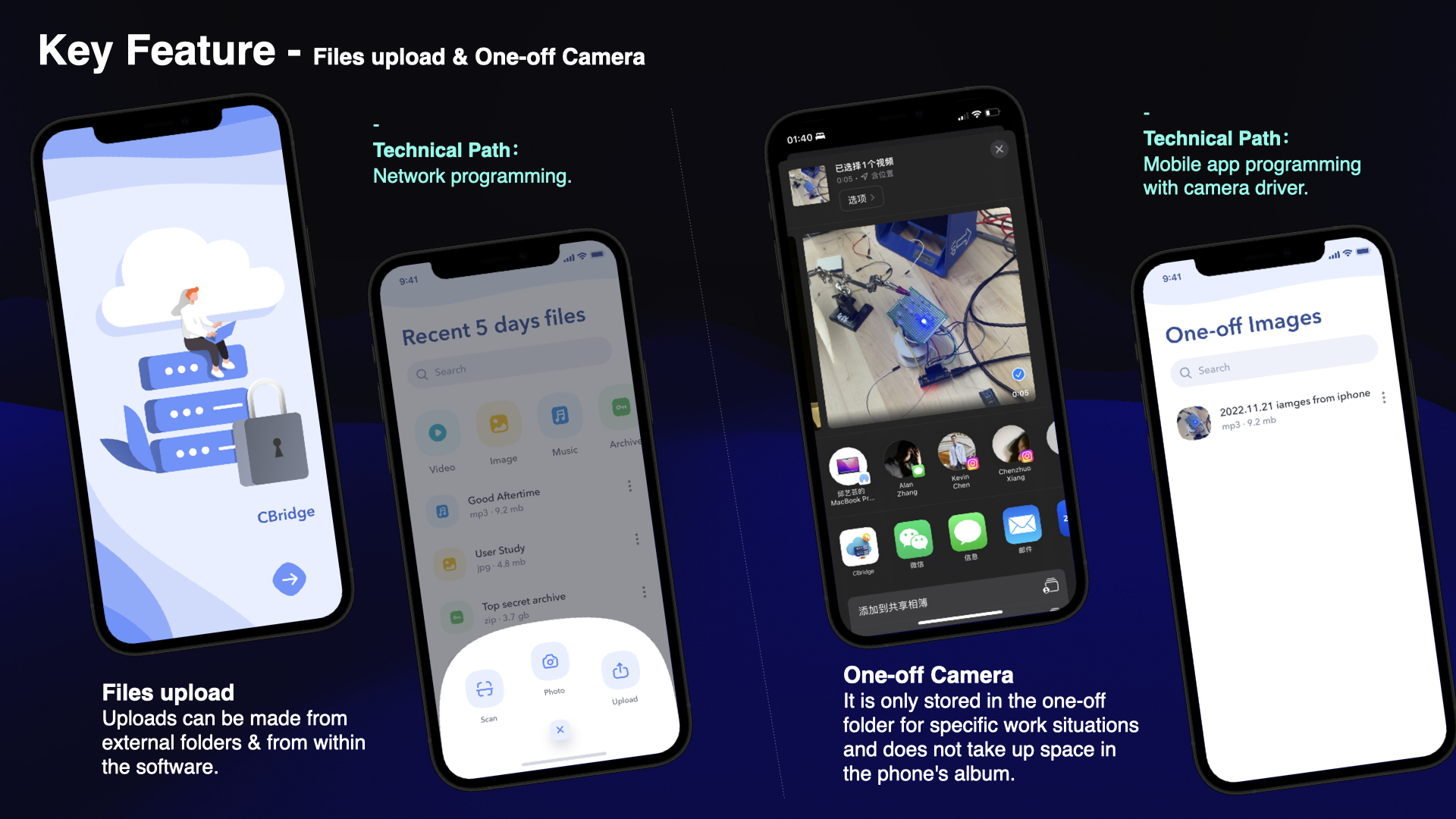
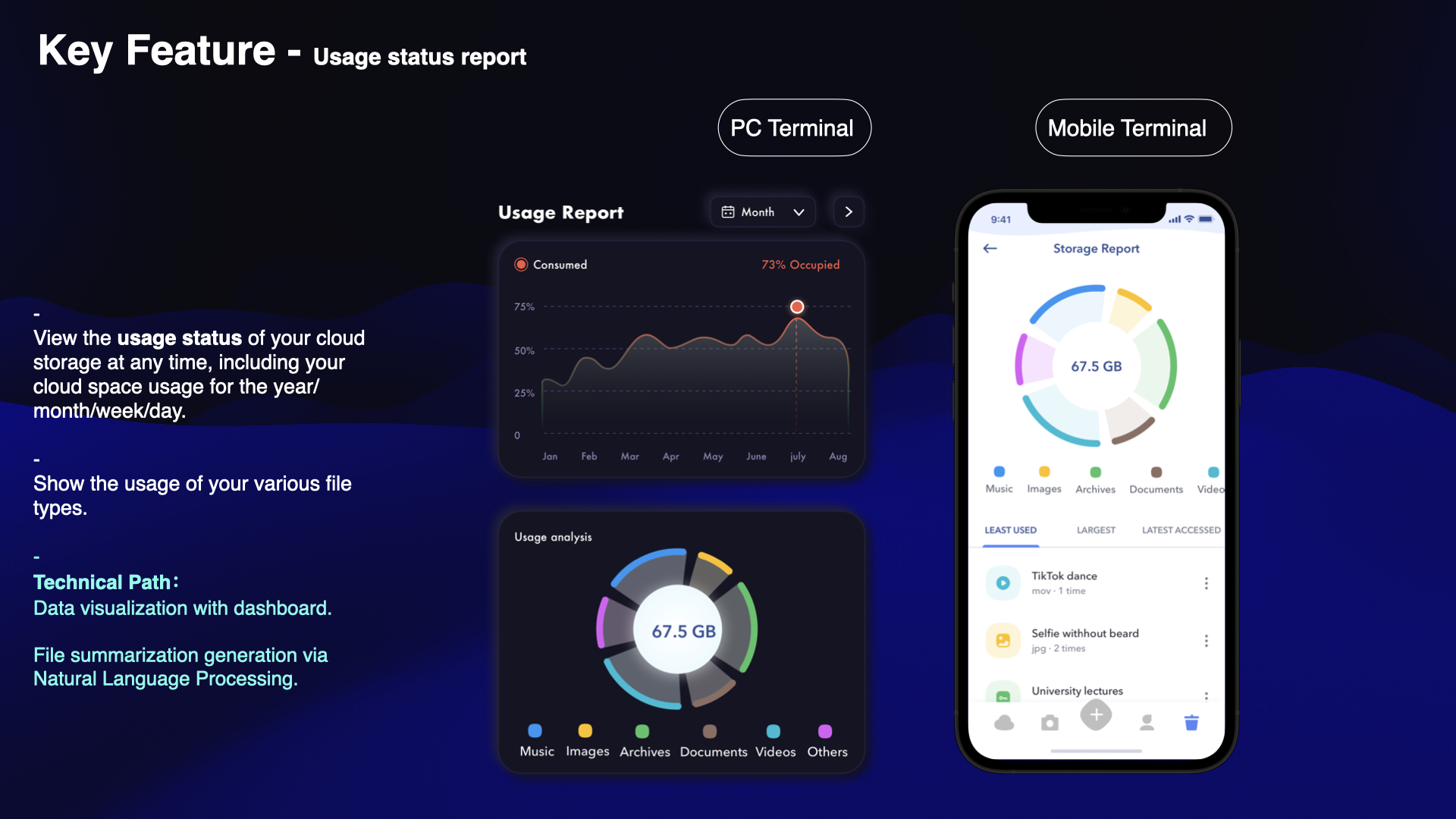
After several iterations, we finally settled down our functionalities from both hardware and software perspectives. In order to let the users use our product in the most user-friendly way, we choose to embed our hardware component in phone or laptop chargers so that users do not need to connect them to their devices specifically. Meanwhile, this reduces the manufacturing cost of our product. As for the software, we designed both PC and mobile platforms, so users could manage their cloud usage with their multiple devices, and they could also use our application to transfer files in a carbon-friendly way.
Areas to improve: one thing that we did not do pretty well during ideation was that we did not figure out what functionalities our product should have in the first place. Actually, we changed our ideas for our product’s core functionalities multiple times even after the prototyping and evaluation. Although it is true that evaluation is conducted for us to better design our product, changing our product’s major functionalities should not be done after that. Fortunately, we settled down the functionalities after another meeting in the final week, and our product’s key functions are summarized as follows:
Prototyping & Evaluation
Prototyping
We did the software prototyping by Figma (thanks to Cloud and Yilia), and Yusam prototyped our charger hardware with his own circuit designs.
Evaluation
In general, we found the issues below during our evaluation:
- Users do not know the meaning of the sync button.
- Users do not know CBridge ’s functions.
- The App on different devices could not be recognized as one app
- Users don’t need the sync button. They want to upload automatically.
- Users want to jump directly from the app on the device itself to CBridge for backups, such as cameras and folders.
- The graphical interface needs to be more visible, including resizing texts and streamlining visual information.
- Users don’t like the “deletion” button, it makes them feel very anxious.
- Users need a lot of descriptive information after choosing a specific function.
- Users want to see the folder UI on the computer side first, and then have pop-ups.
- PC software’s logic is confusing. Users do not know how to do specific tasks.
Evaluation Reflection
- What’s the easiest part when running the evaluation? We found that users are used to clicking buttons to seek instructions for the next step, rather than reading instructions. The easiest step is that they click icons to find the next step. By using the low-fidelity mockup through phone and laptop, It allowed our users to follow each step.
- What’s the most difficult part when running the evaluation? During the time of testing our usability test, the most difficult part is that users could not recognize the difference between the mobile phone and laptop, and they would mistakenly think that there are two Apps. Our design process has caused troubles for users; Similarly, it is not clear enough on our instructions, so that it is hard for users to know what’s the next step, what’s the use of the function, and it spends too much time on finding the correct icon.
- Which part of the evaluation procedure surprised you and what’s your thought of it? In this usability test, we found that the user flow is too complicated. Two terminal devices increase the time for user testing. The later the test, the less patience the user will have, especially after completing the test on the phone, the user is a little impatient when they are told to move forward to the laptop test. In response to this situation, we found that we should reorganize the user flow diagram.
- What would you do differently next time you set up an evaluation exercise? The time during the usability test was longer than what we expected, which shows that we are not familiar with user flow and provide a well-organized prototype. Users need more time and reminder; For this issue, we need to simplify each step, and reorganize our sequence of order.
Critical Reflection
Overall, I think this course project is a good experience for me, because I no nothing about design thinking beforehand. It taught me some basic essentials for designing in a quite short period of time, and I’m glad that my teammates helped me a lot during accomplishing this project while most of them have a strong background of design.
I really appreciate the hard works my teammates have done through this whole procedure. At the beginning of this quarter, I even doubted whether this idea would work because I think it would be very difficult for us to develop a useful tool to change users’ habits of using cloud storage. Even though we did not publish a software in the end, it still gave us hope that this product could be fulfilled in the future, and this is actually the good part of a design thinking product: the product might not be built fully, but its concepts are workable so it might be built in the future.
For me, I really think the hardest part of this project is its time limitation. For each week, we are required to submit a report step by step. Had we got more time to finish this, I believe we could even build this app up and publish it on the App Store. Also, because of the time limitation, we couldn’t think everything carefully during accomplishing this project. For example, we missed the triangulated insights part for design requirements, and we did not even settle down the key functionalities of our product in the last two weeks.
Finally, to be honest, since I would like to be an AI researcher in the future, I would not say the thinking strategy this course has taught me would mean much in my future career. However, I appreciate that this course has gave me a new perspective for problem solving, even though they are totally different from my research-based problem solving strategy. Also, I think this course let me have a better taste for design in the future. Even though I might not design anything from now on, I could still tell what designs are good and what are bad. In general, I think this course challenged me a lot, from the perspective of being a course itself, and also by its way of thinking and value.
